Lesson: Painting
🎨 Gallery: Painting
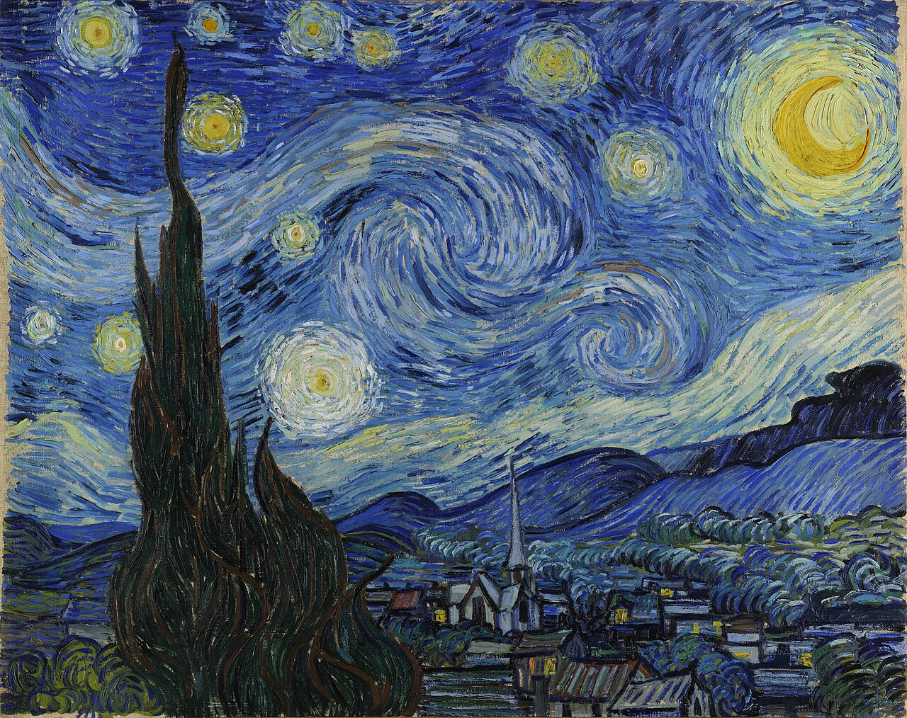
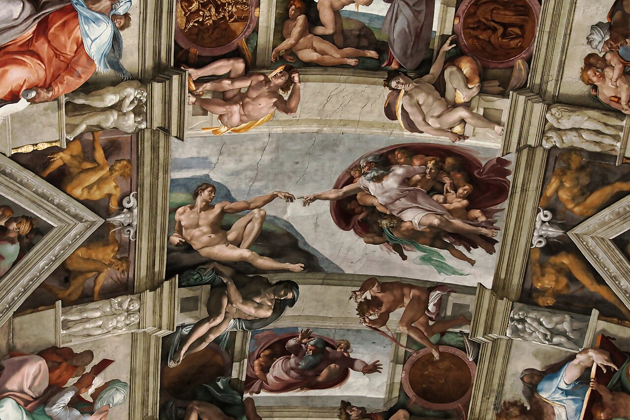
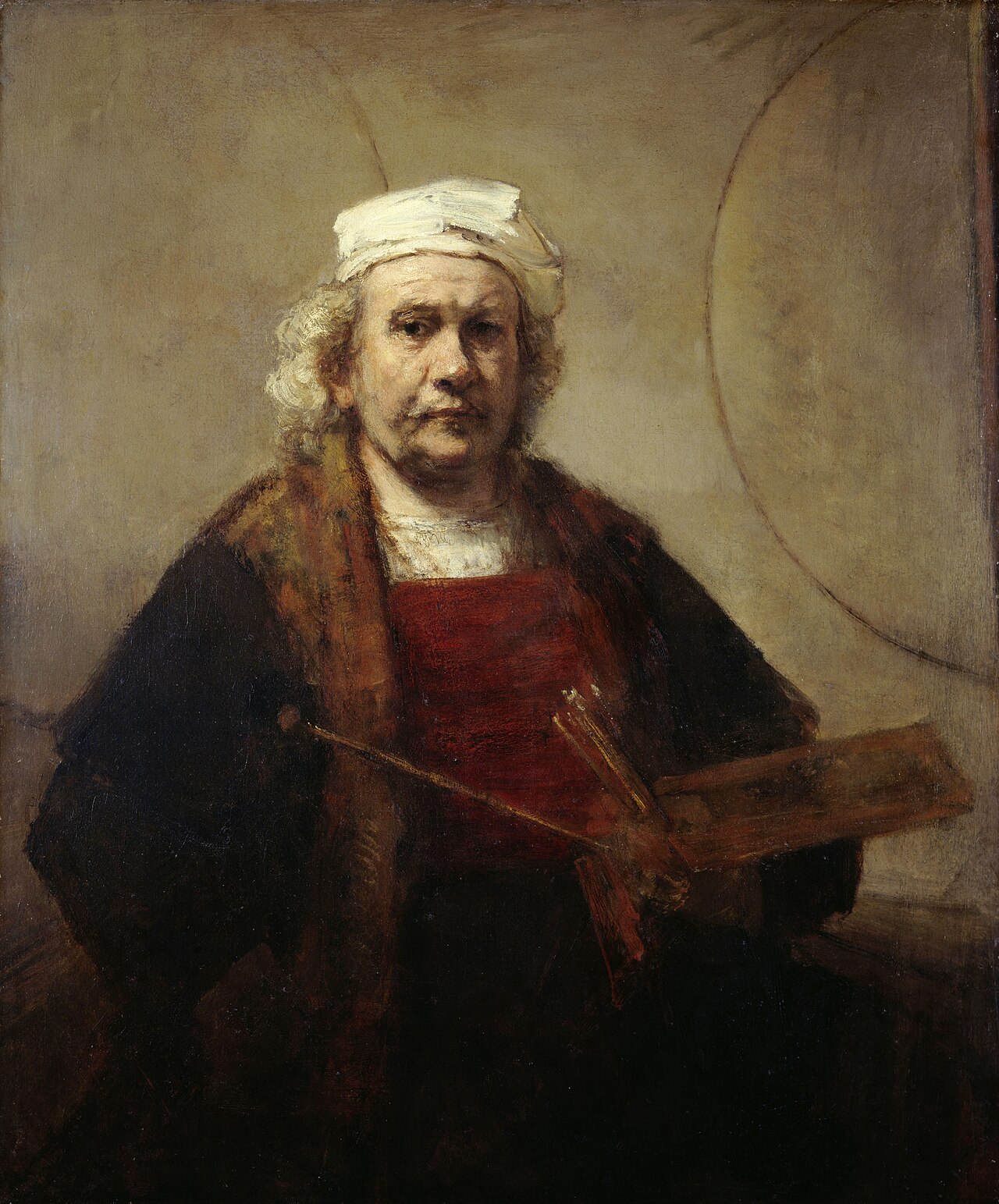
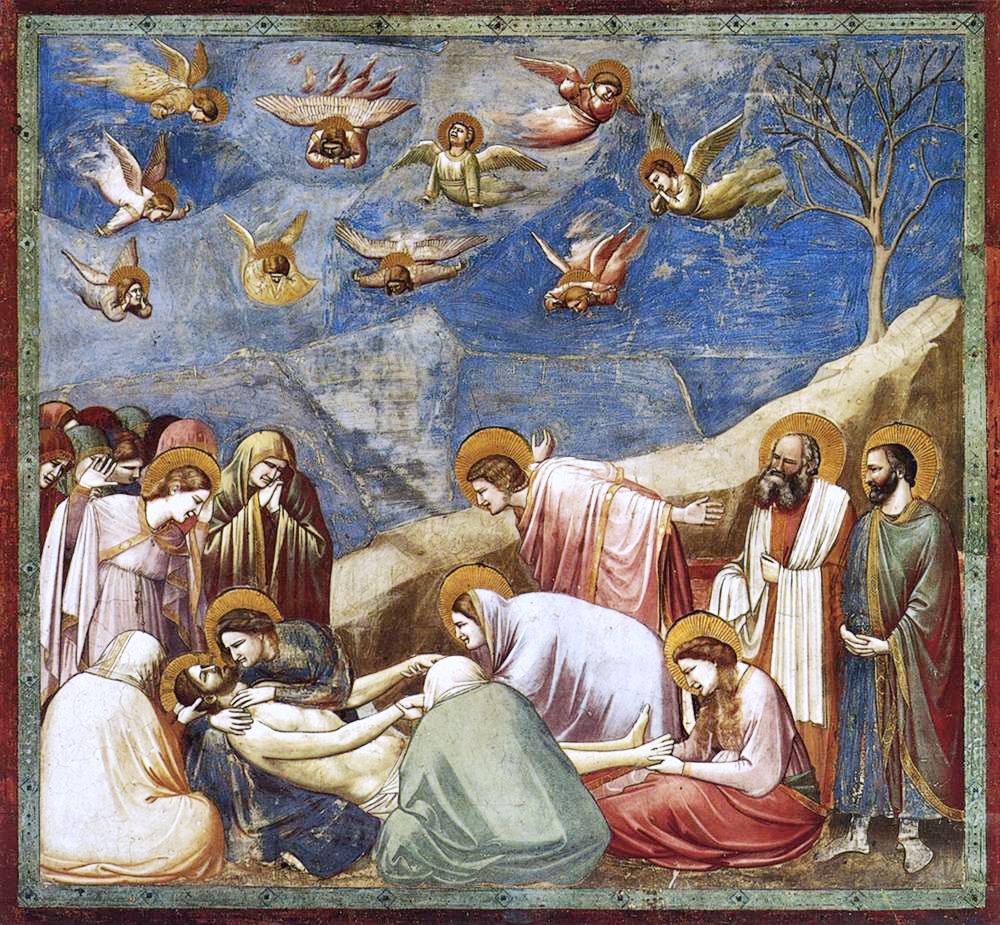
This lesson walks through the key ideas of the unit and then applies them to three paintings. Start with the Gallery above, then read on.
A medium is the material an artist uses. In painting, the medium determines how the finished work looks, how long it lasts, and what the painter can do with it. This lesson covers five major media.
Tempera (pigment bound by egg yolk) produces flat, precise, luminous color, as seen in Cimabue's and Giotto's altarpieces. Fresco (pigment applied to wet plaster) becomes part of the wall itself, which is why Michelangelo's Sistine Chapel ceiling has survived for five centuries. Oil paint, which dries slowly and can be layered, gives the artist the greatest range of color, texture, and detail. Watercolor is translucent, letting the white paper show through. Acrylic dries quickly and does not yellow with age.
Knowing the medium matters because it shapes what is possible. The softness of oil paint is part of what makes a Rembrandt self-portrait feel alive. The precision of tempera is part of what makes a medieval altarpiece feel radiant. When you describe a painting, noting its medium is one of the first observations you should make.
Line can be closed (hard, sharp, definite) or open (soft, blurry, suggested). This lesson also introduces the axis line: an imaginary line that determines the painting's basic visual direction. Think of the strong diagonal in Hokusai's Great Wave from Unit 1, or the vertical axis of Goya's central figure in The Third of May 1808. Those axis lines organize how your eye moves through the painting.
Color has three qualities: hue (the name of the color), saturation (its purity or intensity), and value (its lightness or darkness). Primary colors (red, yellow, blue) cannot be made by mixing. Secondary colors (orange, green, violet) are made by mixing two primaries. Complementary colors sit opposite each other on the color wheel and create visual tension when placed together.
Texture is the surface quality of the painting. It can be smooth (as in a Vermeer) or heavily built up (as in a Van Gogh, where the brushstrokes create ridges you could feel with your fingertips). Texture is tied to the medium: oil and acrylic can be applied thickly, while watercolor lies flat.
Composition is how all of these elements are arranged. This lesson lists several principles: balance, gradation, emphasis, movement, proportion, and unity. These principles determine how your eye travels across the painting and where it rests.
This lesson makes a distinctive claim about painting: unlike music, literature, or film, a painting presents everything simultaneously. There is no sequence. You do not experience a painting in a predetermined order the way you experience a song from beginning to end. Instead, you take it in all at once, and your eye moves around the surface guided by the composition.
This is what this lesson calls "all-at-onceness." It means that when you stand in front of a painting, every element is available to you immediately: the line, the color, the texture, the subject matter, and the composition. The challenge is not access but attention. You have to choose where to look and for how long. Composition helps guide those choices, but the viewer's own perception does the rest.
Abstract painting intensifies this quality. Because there is no recognizable subject to anchor your attention, you respond to the sensa (the pure visual qualities) directly. This lesson argues that this kind of response, freed from representation, gives a sense of presentational immediacy: the painting is not about something, it simply is.
Representational painting depicts recognizable subjects: people, landscapes, objects, events. Abstract painting does not. Between those two extremes lies a spectrum. Cézanne's landscapes are representational but simplified and restructured. Mondrian's grids are abstract but evolved from observations of trees and buildings. This lesson treats neither approach as superior to the other. Both use artistic form to clarify subject matter; they simply define "subject matter" differently.
In representational painting, the subject matter is the value embodied by the depicted scene: war, love, devotion, mortality. In abstract painting, the subject matter is the sensuous itself: the visual qualities of color, shape, and line, experienced directly. Both kinds of painting can produce participative experiences, and both can be analyzed using the descriptive, interpretive, and evaluative tools from Unit 3.
Supplemental Works
The works below expand on the concepts you just learned. Each one connects to a concept from the lesson and gives you a chance to practice the kind of thinking this unit introduces.
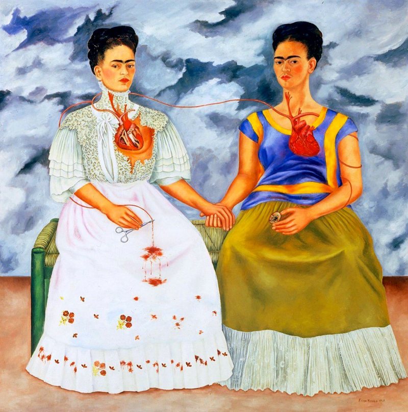
Frida Kahlo, The Two Fridas, 1939. Oil on canvas, 173.5 × 173 cm. Museo de Arte Moderno, Mexico City.
Connects to: Self-Portraiture / Elements of Painting (Line, Color, Composition)
Kahlo painted The Two Fridas shortly after her divorce from the muralist Diego Rivera. Two versions of herself sit side by side on a bench against a stormy sky, holding hands. The Frida on the left wears a white European-style dress; the one on the right wears a traditional Tehuana outfit. Both figures have exposed hearts, connected by a single artery. The left Frida's heart is cut open and bleeding onto her white skirt. The right Frida's heart is intact, and she holds a small portrait of Rivera in her hand.
Notice the elements of painting at work. The composition is symmetrical, which creates a sense of confrontation: these two selves face the viewer directly, side by side, like a double portrait. The color contrast between the white dress and the Tehuana colors separates the two identities visually. The line of the artery connecting the two hearts is the painting's most striking detail relationship: it ties the two figures together physically while their clothing and posture hold them apart.
This lesson discusses how self-portraits represent the self. Kahlo's version takes that idea further than most. She does not paint one self but two, and she uses the elements of painting (color, line, composition) to make the division visible. The painting does not explain the split; it shows it.
Try this
Look at the two hearts and the artery that connects them. Describe the path of the artery in detail. Where does it start? Where does it end? What happens to it in the middle? How does this single detail affect the overall meaning of the composition?
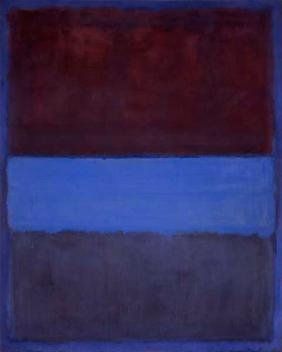
Mark Rothko, No. 61 (Rust and Blue), 1953. Oil on canvas, 115 × 92 inches. Museum of Contemporary Art, Los Angeles.
Connects to: Abstract Painting / All-at-Onceness / Participation
Rothko's paintings consist of two or three rectangles of color stacked vertically on a large canvas. There is no line, no texture in the traditional sense, no recognizable subject. The edges of the color fields are soft and blurred, so the rectangles seem to hover rather than sit firmly on the surface. Rothko insisted that his paintings be displayed in dim light and viewed at close range, large enough to fill the viewer's visual field.
This is abstract painting in its most concentrated form. The subject matter is not a thing but a sensation: the experience of standing inside a field of color. The "all-at-onceness" of painting is fully present because there is nothing to decode, no narrative to follow, no figures to identify. You either participate with the color or you do not.
Rothko said he was not interested in relationships of color or form: he was interested in expressing basic human emotions, such as tragedy, ecstasy, and doom. Whether you accept that claim or find it exaggerated, his paintings test this lesson's concept of participation directly. If you stand in front of one long enough, something happens. Describing what that something is, using the vocabulary of this unit, is the challenge.
Try this
This lesson argues that abstract painting's subject matter is the "sensuous," the pure visual qualities experienced directly. Does Rothko's work support that claim, or does it seem to be about something beyond the visual? How would you describe its subject matter?
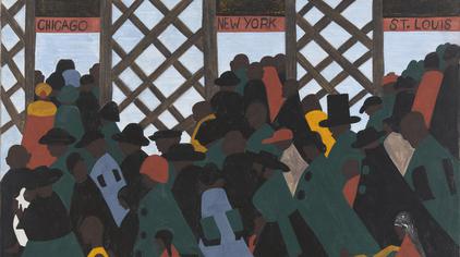
Jacob Lawrence, The Migration Series, Panel 1, 1940–1941. Casein tempera on hardboard, 12 × 18 in. The Phillips Collection, Washington, D.C.
Connects to: Media / Elements of Painting / Representational Painting
Lawrence painted The Migration Series when he was 23 years old. It consists of 60 small panels depicting the Great Migration, the movement of six million African Americans from the rural South to the urban North between 1910 and 1970. Panel 1 shows silhouetted figures crowding through three doorways marked "Chicago," "New York," and "St. Louis."
The medium matters here. Lawrence used casein tempera on hardboard, which produces flat, opaque color with sharp edges. Look at how different this surface is from the soft blending of an oil painting. The flatness is a formal choice: it gives the figures a graphic, almost poster-like quality that emphasizes movement and pattern over individual detail. You cannot see faces. You see masses of people in motion.
The composition of Panel 1 uses strong diagonal lines (the tilted figures, the angles of the doorways) to create a sense of forward motion. The color palette is limited and bold. Lawrence's choice of medium and his treatment of the elements of painting (flat color, closed line, simplified shapes, rhythmic composition) produce content that a more naturalistic approach might not: the sense that migration is a collective force, not just an individual decision.
Try this
Compare the surface of this painting with what you know about oil painting from this lesson. How does Lawrence's use of casein tempera (flat, opaque, sharp-edged) change the kind of content the painting can communicate? Would the same subject matter feel different in oil?
Unit 5 moves from the flat surface of painting to the three-dimensional world of sculpture. Many of the concepts carry over (form, composition, subject matter, content), but sculpture introduces new concerns: mass, volume, sensory space, and the physical relationship between the viewer's body and the work. The critical frameworks remain the same; the vocabulary adapts to a new medium.
Experience It: Standing in Front of a Rothko
Open Mark Rothko's No. 61 in the Gallery above and give it three quiet minutes. If you can, enlarge your browser window so the painting fills as much of your view as possible.
- Before you read anything, notice where your eye goes and how it moves. Does it come to rest anywhere?
- Describe the edges between the colors. How do they behave, and what does that do to the rectangles?
- Rothko said he wanted to express basic human emotions such as tragedy, ecstasy, and doom. Which of these, if any, do you feel, and which qualities of color or edge produce it?