Lesson: The Humanities: An Introduction
🎨 Gallery: The Humanities
This lesson walks through the key ideas of the unit and then applies them to three works of art. Start with the Gallery above, then read on.
The word "humanities" originally marked a separation from theology. Where theological studies focused on God, the humanities focused on human beings and what they do: their history, their ideas, their creations. Today the term covers a broad range of disciplines (philosophy, history, literature, the arts) that share one thing in common. They are all concerned with values: the things human beings care about, fight over, and try to express.
This course approaches the humanities specifically through the arts. The reason is simple: the arts do something the other humanities do not. While historians and philosophers study values, artists reveal them. A painting doesn't argue that war is terrible; it shows you what the terror looks like. A piece of music doesn't explain grief; it lets you feel it. The form of the artwork is what makes this possible, and learning to recognize how form works is the central skill this course teaches.
One important point: the subject matter of art is not limited to the beautiful. Art can be ugly, disturbing, or uncomfortable, and those qualities can be exactly what makes a work powerful.
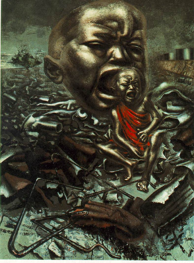
David Alfaro Siqueiros, Echo of a Scream, 1937. Enamel on wood, 121.9 × 91.4 cm. Museum of Modern Art, New York.
Siqueiros's Echo of a Scream is a painting of a crying baby surrounded by industrial wreckage. It is not pleasant to look at. But the distortion, the scale, and the color are precisely what force you to confront what the painting is about: the human cost of war and mechanized violence. Beauty is one value the arts can reveal, but it is not the only one.
Taste is a word we use casually, but it deserves some precision. Taste is an exercise in choosing values. When you say you like a certain song or dislike a painting, you are making a value judgment, whether you realize it or not.
Here is the complication: tastes change. What you loved five years ago may embarrass you now. And the things that are most commercially popular at any given moment are not necessarily the things that last. Here is a strong claim worth considering: public success does not indicate excellence in the arts. A hit song that sells millions of copies may satisfy us temporarily, but a work of art that examines human experience in a lasting way satisfies us at a deeper level. The question of taste, then, is not just "what do I like?" but "can my ability to respond to art develop and grow?"
The answer is yes. And the process of developing that ability is what a humanities course is for. We want to go beyond the surface facts about a work of art and get to the values the work reveals.
Your first response to a work of art is usually emotional. You feel something: shock, pleasure, boredom, confusion. That emotional response is real and it matters, but it is a starting point, not an endpoint. Our responses deepen as we learn more about what we are looking at.
Consider Peter Blume's The Eternal City.
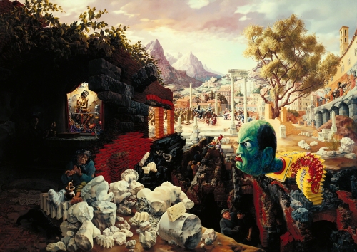
Peter Blume, The Eternal City, 1934–1937. Oil on composition board, 86.4 × 121.6 cm. Museum of Modern Art, New York.
At first glance, it is a strange, crowded painting with a grotesque green head bursting from the center. You might find it bizarre or even silly. But then you learn the background: it was painted in 1937, the "Eternal City" is Rome, and that green head belongs to Mussolini, the fascist dictator. The Blackshirts in the painting are beating people. The figure of Christ watches from a niche. A crippled woman begs nearby. Suddenly the painting is not silly at all. It is an act of political protest disguised as surrealism.
This is the key insight: background knowledge does not replace your direct experience of a work of art, but it gives that experience something to work with. Knowing who Mussolini was doesn't make you feel something you didn't already feel. It helps you understand why you feel it.
Every work of art has a structure: the way its parts are organized in relation to each other. In a painting, structure includes the arrangement of shapes, colors, lines, and textures. In a piece of music, it includes rhythm, melody, and the relationships between sections. In a poem, it includes the arrangement of words and the pattern of sounds.
The term "artistic form" describes a structure that makes its subject matter more meaningful. This distinction is important. Not every arrangement of parts counts as artistic form. A random pile of shapes has structure (the shapes are physically arranged in some way), but that structure does not intensify or clarify anything. Artistic form is structure that does work: it focuses your attention, organizes your perception, and reveals something about the subject that you would not see without it.
Think about the difference between the Mona Lisa and Siqueiros's Echo of a Scream.
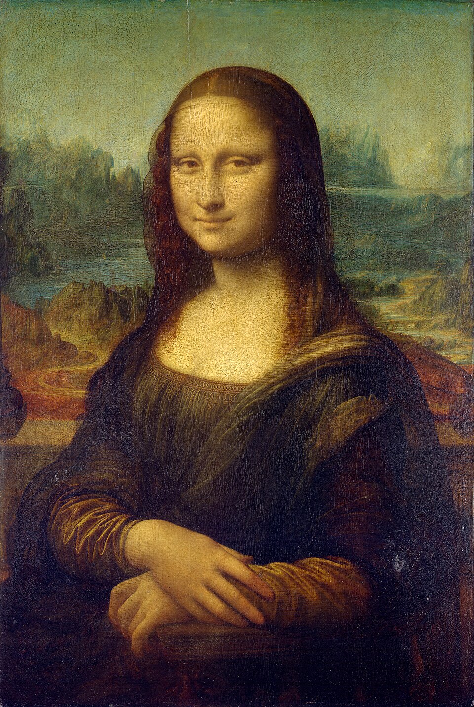
Left: Leonardo da Vinci, Mona Lisa, c. 1503–1519. Oil on poplar, 77 × 53 cm. Musée du Louvre, Paris. Right: Siqueiros, Echo of a Scream, 1937.
The Mona Lisa is calm, balanced, and symmetrical. Echo of a Scream is fragmented, distorted, and jagged. Both paintings have artistic form, but the form does different things. Leonardo's form creates stillness and mystery. Siqueiros's form creates urgency and pain. The structure of each painting is inseparable from what it means.
Key Term
Artistic form: a composition or structure that makes subject matter more meaningful. This is a term you will use throughout the course.
There is a difference between looking at a work of art and perceiving it. Looking is passive: your eyes take in the image. Perception is active: you notice how the parts relate, you register the composition, you connect what you see to what you know. We are not likely to respond sensitively to a work of art that we do not perceive properly.
Proper perception requires two things working together. First, you need to pay attention to the formal qualities of the work: its structure, colors, shapes, and arrangement. Second, you need whatever background knowledge helps make sense of what you are seeing. Neither one is sufficient on its own. You could know everything about the history of fascism and still miss what Blume is doing with composition in The Eternal City. And you could notice every line and color in the painting without understanding what the green head means.
This is why a humanities course combines study (which gives you background) with close attention to actual works of art (which trains your perception). The goal is to bring both capacities together so that your response to art becomes richer and more informed over time.
The final concept in Unit 1 ties everything together. An abstract idea is something you can think about but cannot touch: justice, mortality, freedom, grief. A concrete image is something specific and physical: a wilting flower, a clenched fist, a child crying in a junkyard. The arts work by using concrete images to give abstract ideas a visible or audible form.
A classic illustration is Robert Herrick's shaped poem "The Pillar of Fame," where the physical shape of the text on the page mirrors the subject of the poem. But the principle applies to every art form we will study.
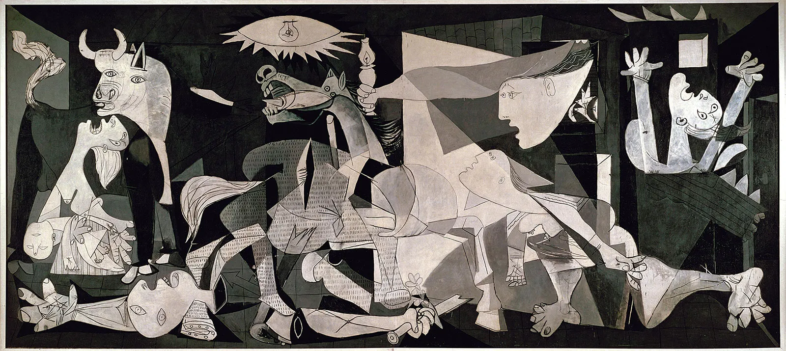
Pablo Picasso, Guernica, 1937. Oil on canvas, 349.3 × 776.6 cm. Museo Reina Sofía, Madrid.
Picasso does not write an essay about the bombing of Guernica; he paints it. The screaming horse, the dismembered soldier, the light bulb shaped like an eye: these are concrete images that carry abstract ideas about violence, suffering, and human cruelty. The composition (the artistic form) is what holds them together and gives them power.
Keep this relationship in mind as we move through the course. Every unit will ask you to look at how a particular art form uses concrete materials (paint, stone, sound, movement, light) to make abstract values visible. That is, in one sentence, what the humanities through the arts are about.
Supplemental Works
The works below expand on the concepts you just learned. Each one connects to a concept from the lesson and gives you a chance to practice the kind of thinking this unit introduces.
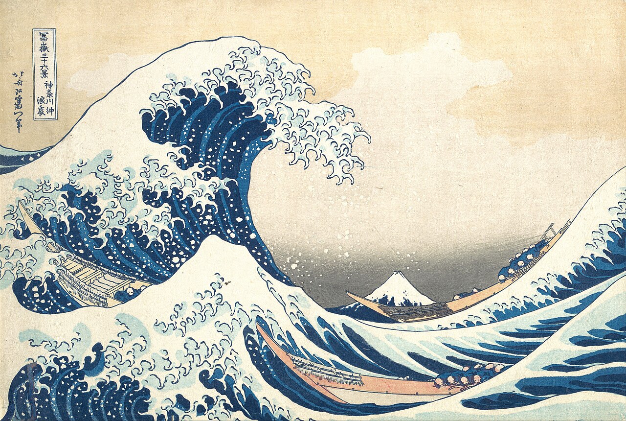
Katsushika Hokusai, The Great Wave off Kanagawa, c. 1831. Woodblock print, ink and color on paper, 25.7 × 37.9 cm. Metropolitan Museum of Art, New York. Public domain.
Connects to: Structure and Artistic Form / Art, Commerce, and Taste
You have almost certainly seen this image before. It appears on phone cases, T-shirts, coffee mugs, and dorm room posters. That familiarity is precisely what makes it useful here, because this unit asks a pointed question about the relationship between taste, commerce, and the actual experience of a work of art.
Hokusai made this print around 1831 as part of a series called Thirty-six Views of Mount Fuji. The subject is not the wave itself but the relationship between the wave and the mountain. Look at the composition: Fuji sits low and still in the center background, a small triangle of permanence, while the enormous wave rears up and curls over it. The boats in the trough are easy to miss at first glance, but they are carrying fishermen. The wave dwarfs everything human. Fuji, however, endures.
The structure of the print does real work. Hokusai uses the curve of the wave to frame Fuji, and the foam at the crest breaks into claw-like fingers that echo the shape of the mountain itself. The diagonal energy of the water pulls your eye from left to right, but Fuji stops it. The tension between motion and stillness is what gives the image its force. Without that composition, this would just be a picture of a big wave.
Now consider: when you saw this image on a coffee mug, did any of that register? Our perception of a work of art depends on what we bring to it. Knowing Hokusai's compositional choices changes what you see. That is the difference between looking at something and perceiving it.
Try this
Think of another image you see constantly (on ads, social media, merchandise). Have you ever stopped to look at it carefully? What might you be missing by treating it as background noise?
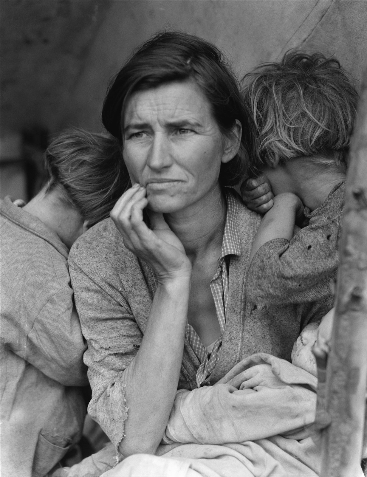
Dorothea Lange, Migrant Mother, 1936. Gelatin silver print. Library of Congress, Washington, D.C. Public domain.
Connects to: Perception and Responses to Art
Consider the claim that our response to art deepens when we know something about the background of the work. This photograph is a good test of that claim.
Look at the image first without any context. A woman stares past the camera. Her expression is hard to name: it is not despair exactly, but something closer to exhaustion combined with alertness. Two children press their faces into her shoulders, hiding from the lens. A baby rests in her lap. The composition is tight. Lange placed the woman's hand near her chin, and the lines of the children's bodies angle inward, creating a pyramidal structure that gives the image a quality of weight and stillness despite the evident distress.
Now the background. The woman's name was Florence Owens Thompson. She was 32 years old, a migrant pea-picker in Nipomo, California, during the Great Depression. Lange, working for the Farm Security Administration, stopped at the camp on impulse and spent about ten minutes making six exposures. This one became the most reproduced photograph in American history. It helped persuade the federal government to send emergency food aid to the camp.
Does knowing this change what you see? The answer is yes: background knowledge doesn't replace direct perception, but it gives your perception something to work with. The composition (the structure) was always there, but the context gives the structure a subject matter that clarifies a set of values: about poverty, about dignity, about the obligations a society owes to its most vulnerable members. The form makes the values visible. That is the central argument of Unit 1.
Try this
Thompson's family later said she never liked the photograph and felt it had been taken without her full consent. Does knowing that change your response again? Think about whether the values revealed in a work of art always belong to the artist, or whether they can come from somewhere the artist didn't intend.
Video: Kara Walker's A Subtlety at the former Domino Sugar Refinery, Brooklyn, 2014. Source: YouTube.
Connects to: Values, Taste, and Abstract Ideas/Concrete Images
An important point from early in this unit: the subject matter of art is not limited to the beautiful and the pleasant. Art can also help us understand the dark sides of human experience. Kara Walker's A Subtlety (2014) is a striking example of that principle.
Walker constructed a massive sphinx-like figure, roughly 35 feet tall and 75 feet long, out of white sugar and polystyrene foam. She installed it in the soon-to-be-demolished Domino Sugar Refinery in Brooklyn, a factory where sugar had been processed since the 1880s. The figure's features reference the "mammy" stereotype from American racial history. Surrounding the sphinx were smaller figures of young boys, sculpted from molasses and sugar, many of them melting in the warehouse heat during the exhibition's run.
Notice the abstract-to-concrete logic at work here. The abstract ideas are large ones: the history of slavery, the economics of the sugar trade, the persistence of racial stereotypes. Walker makes them concrete by building them out of the actual material (sugar) that connects all three. The warehouse itself becomes part of the artistic form, because it is the physical space where that material was processed by laborers for over a century. The work is intentionally uncomfortable. It connects the sweetness of sugar (something we associate with pleasure and childhood) to a history of forced labor and dehumanization. Walker forces the viewer to hold both of those associations at the same time.
When we talk about taste, we raise the question of whether commercial popularity equals artistic excellence. Walker's piece asks a different version of the same question: what happens when a work of art is designed to make you uncomfortable? Does discomfort disqualify something from being art, or is discomfort sometimes the point? These are the kinds of questions a humanities course trains you to sit with rather than answer quickly.
Try this
It helps to distinguish between your emotional response to a work of art and a fuller understanding of it. Watch the video above and notice your initial reaction. Then ask yourself: what values is Walker trying to reveal? Are those values ones you were already thinking about, or did the work bring them to the surface?
The three supplemental works above span nearly two centuries, three different media (woodblock print, photograph, sculptural installation), and three very different cultures. But they share a common thread: in each case, the structure and form of the work are what make the subject matter meaningful. Hokusai's compositional choices turn a wave into a meditation on impermanence. Lange's framing turns a woman at a campsite into an argument about human dignity. Walker's material choices turn sugar into a confrontation with history.
Keep these ideas in mind as you move forward. In Unit 2, we will look more closely at how to distinguish a work of art from other kinds of objects. In Unit 3, you will learn a systematic method for describing, interpreting, and evaluating artworks. The vocabulary you build in those units will let you do more precisely what we have been doing here: paying close attention to how form reveals values.
Further Exploration
- Smarthistory: Hokusai, Under the Wave off Kanagawa (The Great Wave), a free essay on composition and context
- Smarthistory: Dorothea Lange, Migrant Mother, an essay and video on how a single photograph became a symbol
- Wikipedia: Humanities, an overview of the fields and their history
Experience It: Values in a Single Image
Choose one of the six works in the Gallery above, the one you react to most strongly. Spend two full minutes with it before you answer.
- What is the first thing you feel when you look at it? Write one sentence about that feeling.
- Now describe the work's structure: what is large, what is small, where does your eye travel, and what is it not allowed to rest on?
- What value (justice, grief, dignity, freedom, peace, fear) does the work make visible, and which choices in its form make you say so?